CODITAS
(Logo re-design and branding)
(Logo re-design and branding)
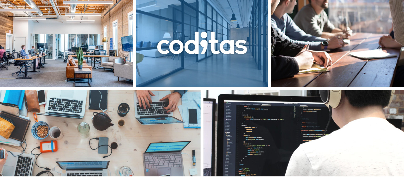
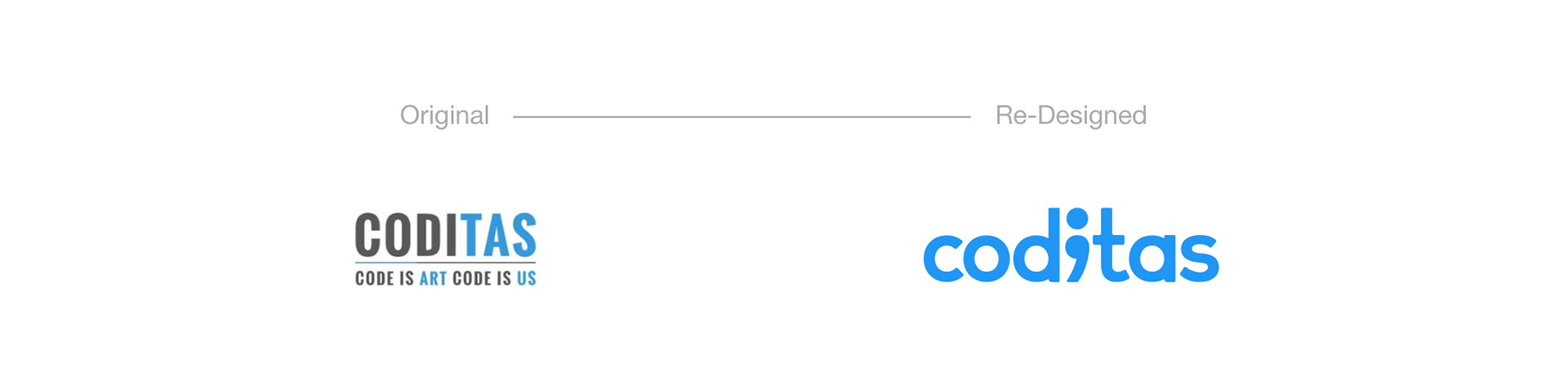
Coditas is a IT Services company based out of Pune, India and Delaware, USA. They contacted me for their re-branding. They have been operating under their old logo for over 5 years and as their company is growing, they wanted to revamp everything, starting with their logo.
Research
(Observations and Insights)
Many discussion sessions were taken with the client with stylescapes to understand the company and their market. A basic research was done on similar companies, competitors and what will the be the best way to redesign the logo without over-doing it.
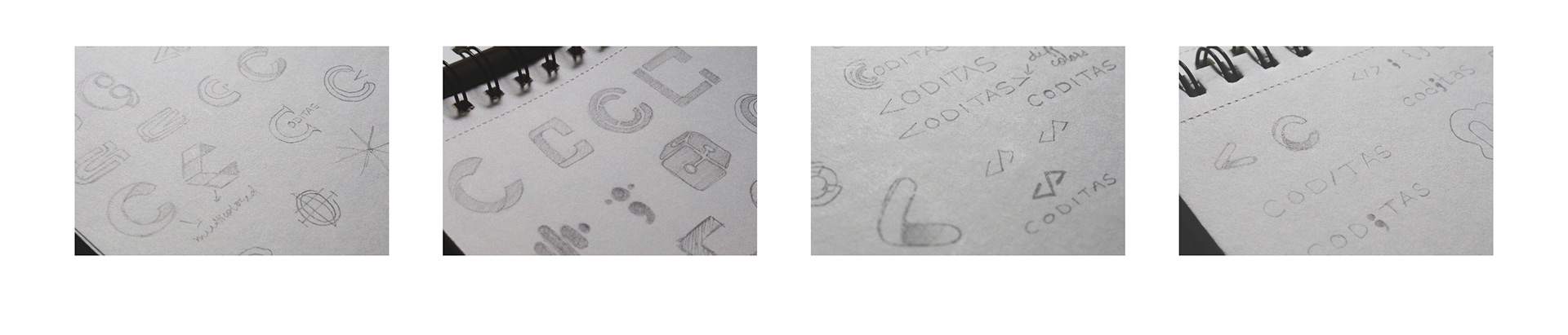
From the Sketchbook
Sketches and explorations were done in various styles that could fit CODITAS.
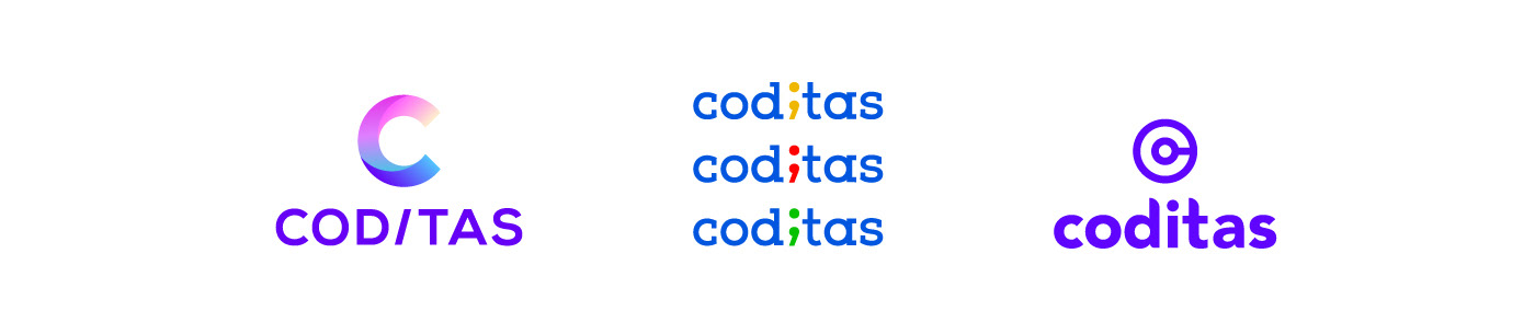
Some of the logo options that were presented.

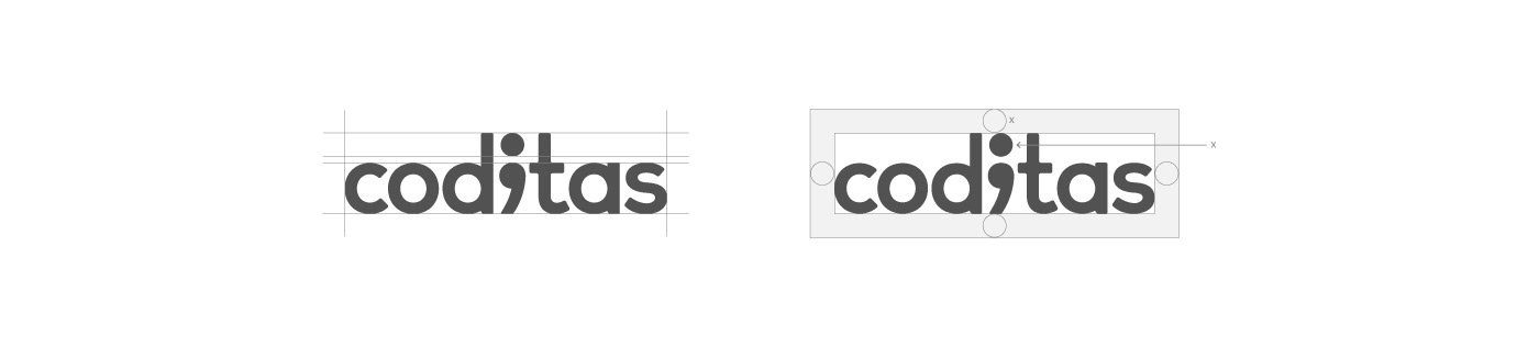
Behind the Logo
The idea was placed on the table by the Coditas team and they were very passionate about making the logo with a semicolon. They came up with a very clear idea on how they wanted the logo to look like therefore it was decided to keep the logo a wordmark & lowercase all the way to represent the coding language. The challenge for me was the execution and design implementation of their vision.
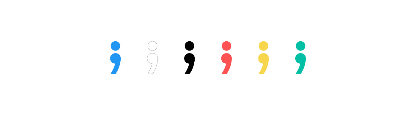
The "i" was swapped in with the semicolon - as a semicolon is commonly used while coding. As the semicolon "i" is at the perfect center of the logo it also depicts that the company is code centric. The logo is kept simple, minimal but with a bit of character to it. The typeface is custom made for their logo and taglines to keep the flow going throughout the identity.

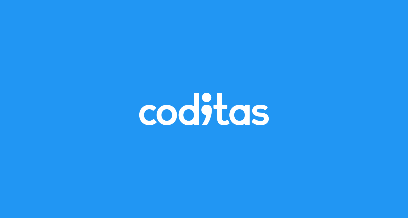

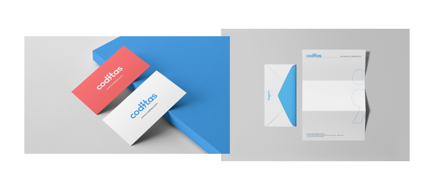
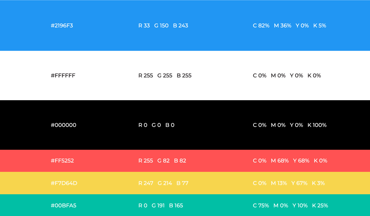
Color Palette
The original logo was blue therefore it was decided that the logo will be kept blue but will have a change of value and intensity. The primary colors were also paired up with supportive vibrant shades so that it reflects the company's personality while it being more flexible for future use in it's visual language.
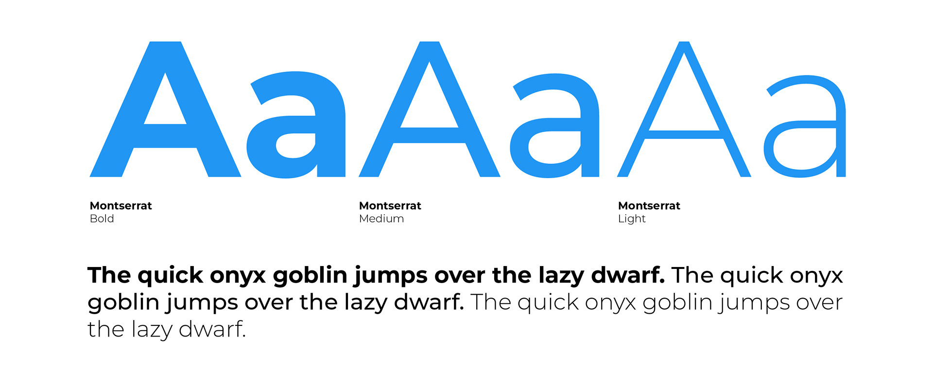
Typography
The logo was a custom creation by using base letters from typefaces like Nexa and Montserrat. We settled with Montserrat to be used everywhere (print to digital) - as Montserrat has a huge family and can be very adaptable for a design savvy company.